The Importance of Building a Responsive Website: Enhancing User Experience Across Devices
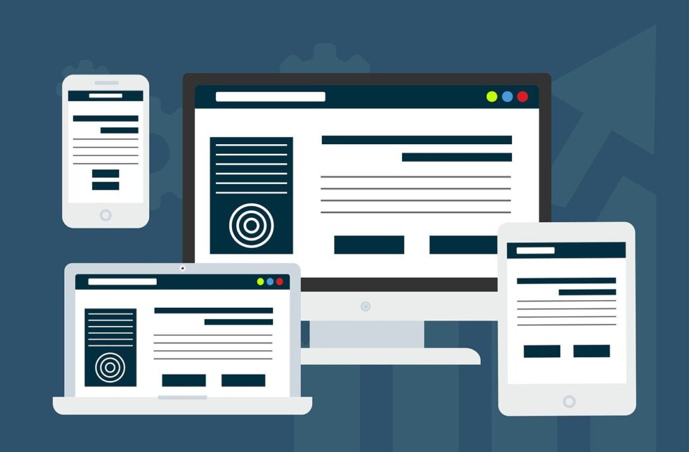
In today’s digital landscape, where users access websites on various devices, creating a responsive website has become an essential practice for businesses and organizations. Responsive design refers to a web design approach that ensures a website’s layout, content, and features dynamically adapt and respond to the user’s device and screen size. It aims to provide an optimal viewing and interactive experience across a wide range of devices, including desktop computers, laptops, tablets, and smartphones.
With responsive design, a website automatically adjusts its layout and content based on the screen size and orientation of the device being used. This allows users to access and navigate the website with ease, regardless of the device they are using. Responsive design eliminates the need for separate websites or applications for different devices, streamlining the development process and reducing maintenance efforts.
Key principles and techniques involved in responsive design include:
Fluid Grids: Designing layouts based on relative units, such as percentages, rather than fixed units like pixels. This allows the content to adapt and fill the available space proportionally.
Flexible Images and Media: Optimizing images and media to resize and scale seamlessly based on the screen size, ensuring they remain visually appealing and accessible.
Media Queries: Using CSS (Cascading Style Sheets) media queries to apply different styles and layouts based on the characteristics of the user’s device, such as screen width, resolution, and orientation.
Mobile-First Approach: Designing and developing the website with a focus on mobile devices first, then progressively enhancing the experience for larger screens. This approach prioritizes essential content and functionality for mobile users.
Touch-Friendly Interactions: Designing user interfaces with touch gestures in mind, such as swipe, pinch-to-zoom, and tap, to ensure optimal usability on touch-enabled devices.
The benefits of responsive design include improved user experience, increased accessibility, better search engine visibility, and simplified maintenance and updates. It allows businesses and organizations to reach a broader audience and ensures that their website delivers a consistent and engaging experience across different devices, contributing to customer satisfaction and retention.
Reach and Engage a Wider Audience:
With the proliferation of smartphones and tablets, more users are browsing the internet on mobile devices than ever before. By employing responsive design, you can cater to this growing mobile audience, ensuring that your website is accessible and visually appealing across devices. By reaching and engaging a wider audience, you have the opportunity to expand your customer base and increase conversions.
Seamless User Experience:
A responsive website delivers a seamless user experience by adapting its layout and content to fit different screen sizes. Users no longer need to zoom in or scroll horizontally to view content, as the website automatically adjusts to their device’s screen dimensions. This improved usability leads to higher user satisfaction, longer visit durations, and increased chances of users exploring and interacting with your website’s content.
Cost-Effectiveness and Efficiency:
Developing a separate website or mobile application for each device type can be costly and time-consuming. Responsive design streamlines the development process, allowing you to create a single website that caters to all devices. This approach reduces the need for duplicate content, simplifies maintenance, and lowers long-term costs. Additionally, updates and changes can be implemented across all devices simultaneously, ensuring a consistent user experience and saving valuable resources.
Improved Search Engine Visibility:
Search engines, such as Google, highly value user experience when determining search rankings. Responsive websites often perform better in search engine results because they provide a seamless experience across devices, reducing bounce rates and increasing user engagement. Furthermore, having a single website URL for all devices eliminates the need for redirections, which can positively impact search engine optimization (SEO) efforts.
Future-Proof Your Website:
Technology is constantly evolving, with new devices and screen sizes being introduced regularly. Building a responsive website ensures its adaptability to future devices, allowing you to future-proof your online presence. Instead of investing time and resources into adapting your website to each new device, responsive design provides a flexible framework that can easily accommodate technological advancements.
In an increasingly mobile-centric world, creating a website using responsive design is no longer an option but a necessity. By embracing responsive design, you enhance user experience, reach a wider audience, improve search engine visibility, and streamline development and maintenance efforts. A responsive website demonstrates your commitment to providing an optimal browsing experience across devices, ultimately contributing to increased user satisfaction, engagement, and business growth. Embrace responsive design and position your website at the forefront of the digital landscape, ready to captivate users on any device they choose to explore your online presence.

